
The winter games have never before been played in a city in the Southern Hemisphere. The time has now come to open the doors to a South American Winter Olympics! Santiago, Chile provides many benefits to the games including the sweeping Andes mountains, the proximity to several major ski resorts and the size of the city itself contribute to Santiago’s Olympic potential. My mission is to bring the glory of the Andes and the culture and natural beauty of Santiago to the forefront as the world opens their arms to the montañas nevadas de Chile (snowy mountains of Chile)!
A South American Olympics
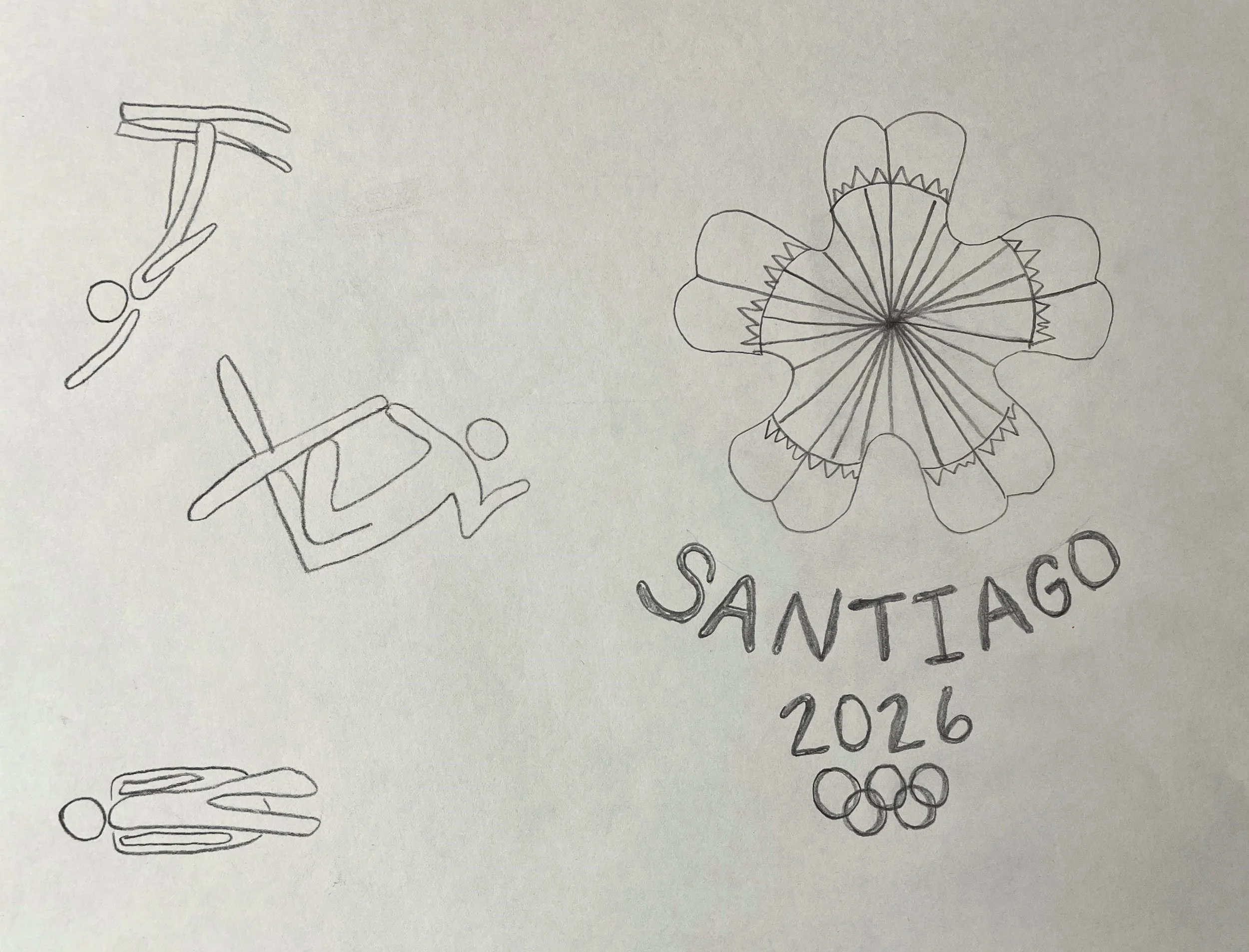
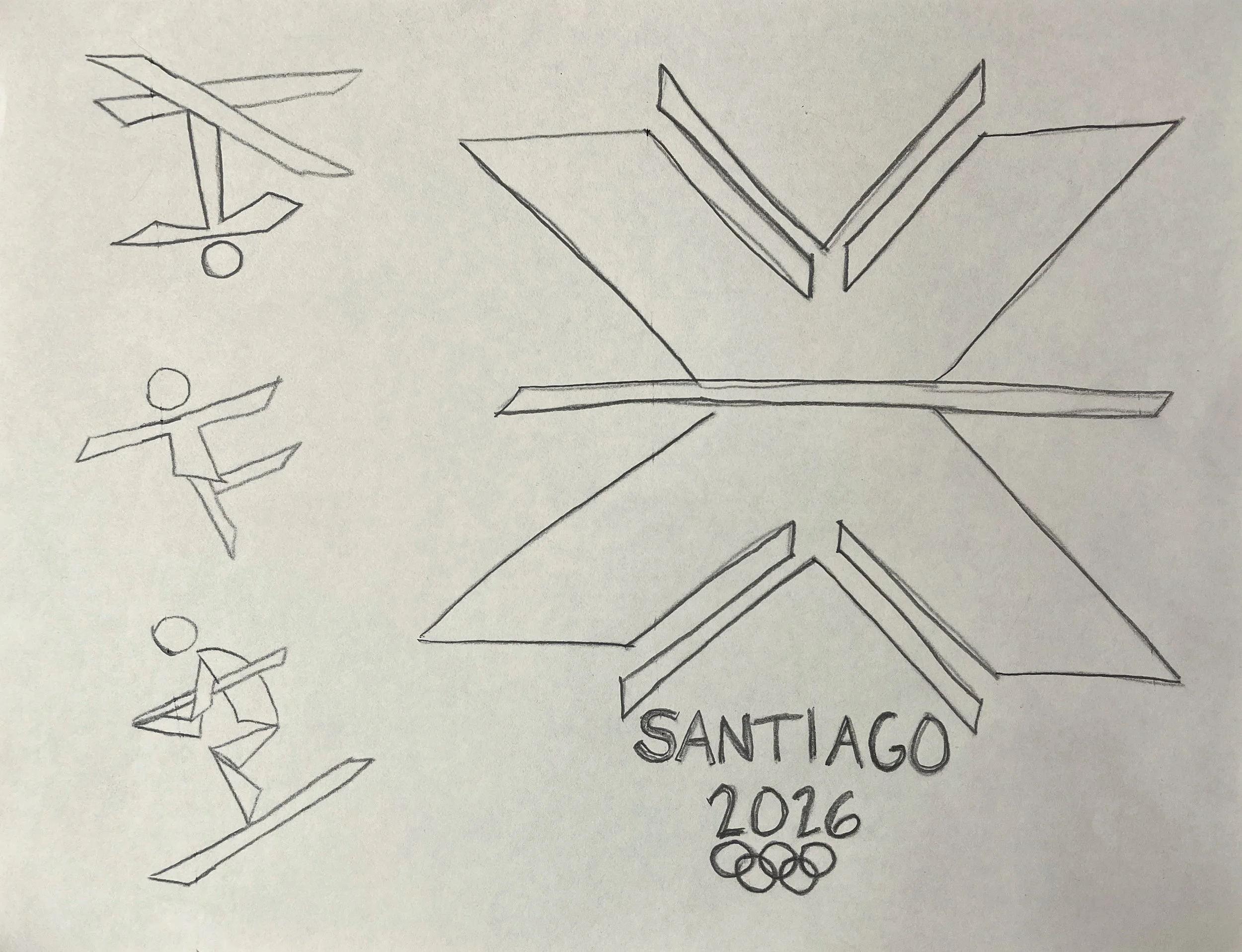
Sketches
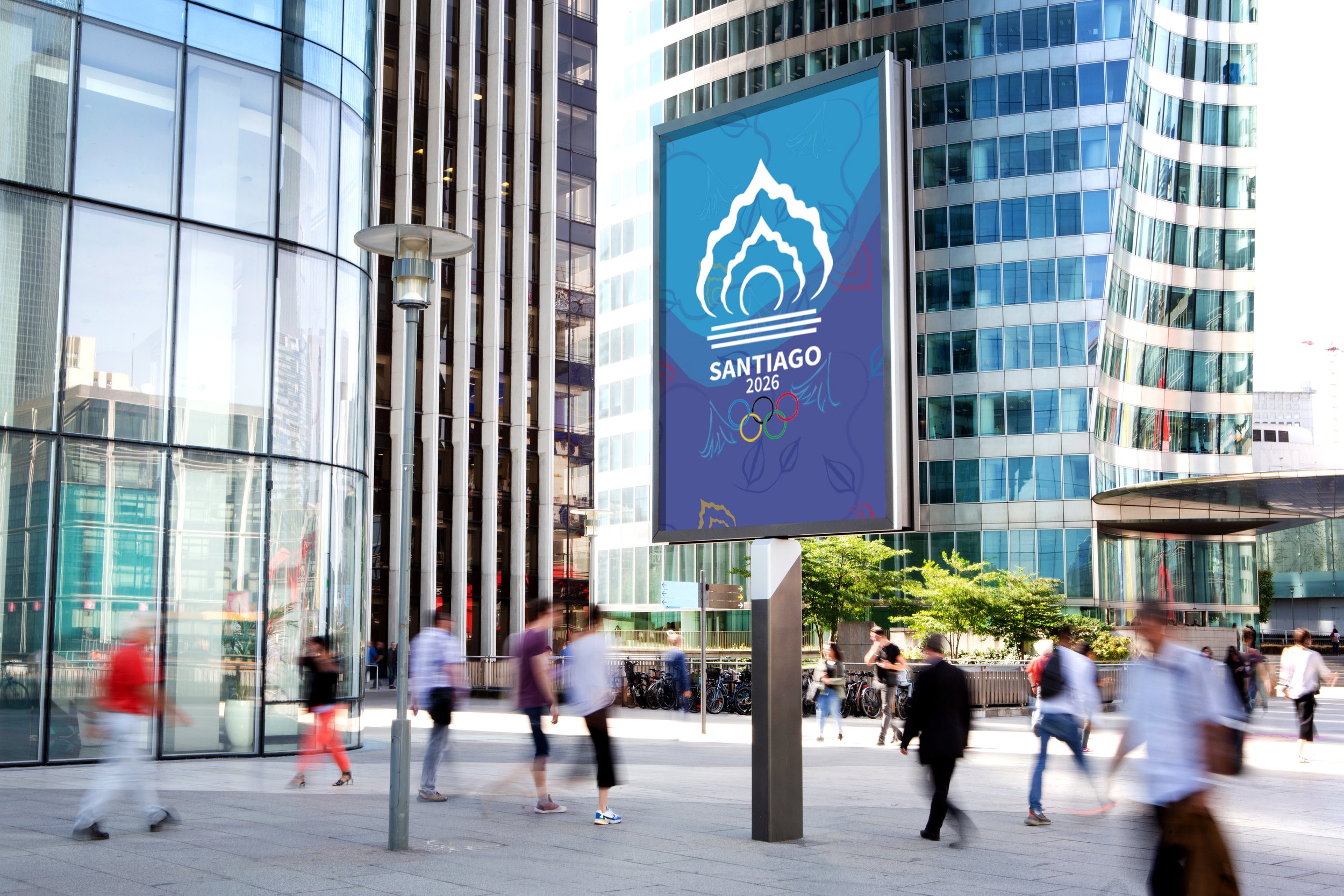
In order to represent the country of Chile, I wanted my logo and pictograms to show a relationship between the people, the architecture, and the games. The logo I designed combines the beautiful traditional dresses girls wear in Chile with the stripes of the cowboy poncho and distinctive look of the Chupalla, a traditional Chilean hat made of straw that horsemen wear.
If you look at the logo carefully, you will find many elements of the country of Chile interwoven with the idea of the Olympic torch.


Color
The final logo went through many color studies until one scheme was chosen. The colors red, yellow, blue, and green in the following combinations were selected to represent the vitality of the country of Chile.

Typography
I chose Source Sans Variable Bold because it’s easy to read, has great visibility from far away, and has an updated and clean look. It looks great in all caps so that’s how I used it for my logo.

Digital Iterations
My logo started out with a serif font and went through some color changes before it was finalized. The bottom of the hat was taken off after feedback because the 2026 ended up looking like it was a handle itself. The pictograms went through many changes as well. Many were a bit too curvy or sharp and needed to be refined.


