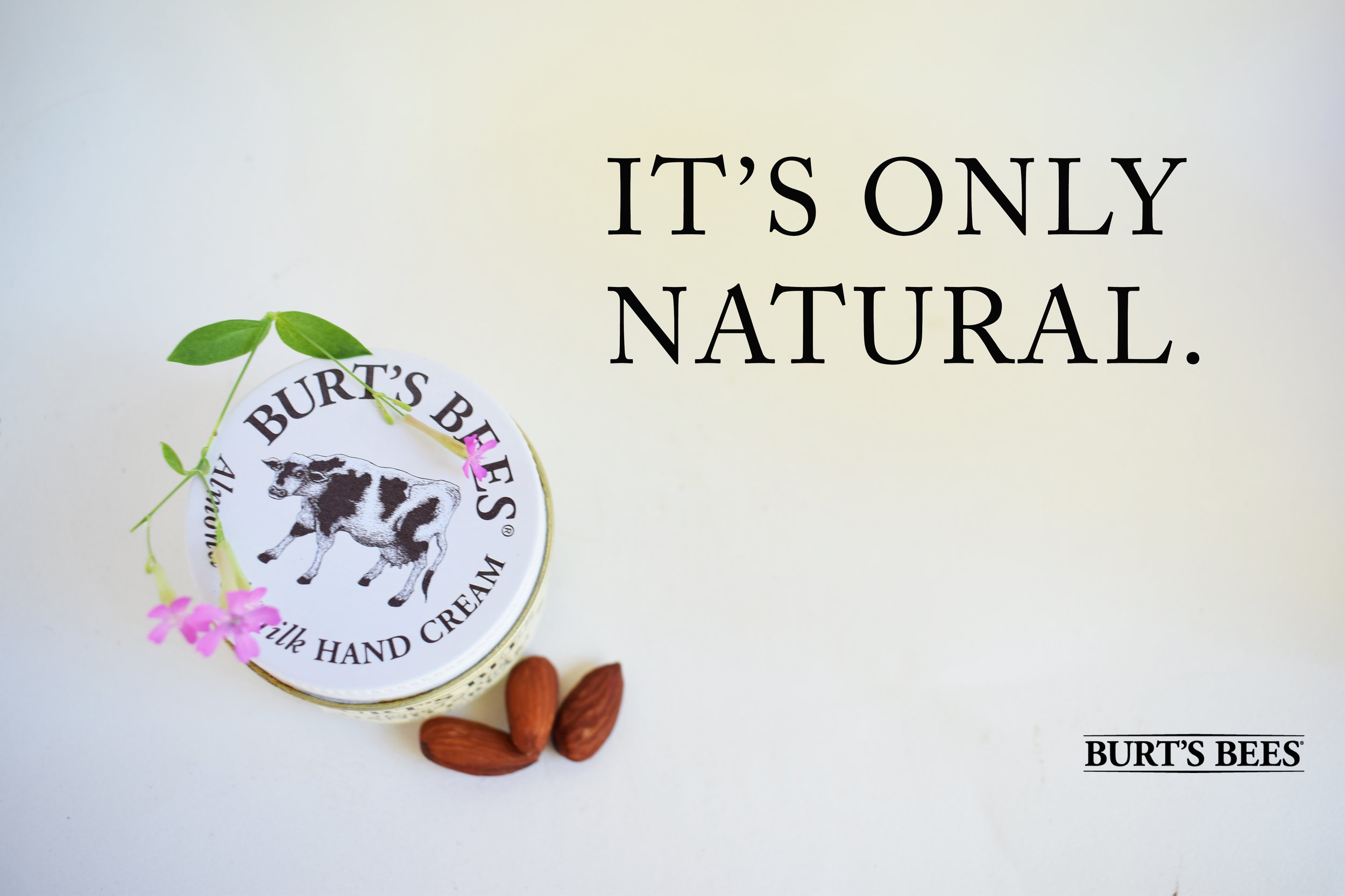
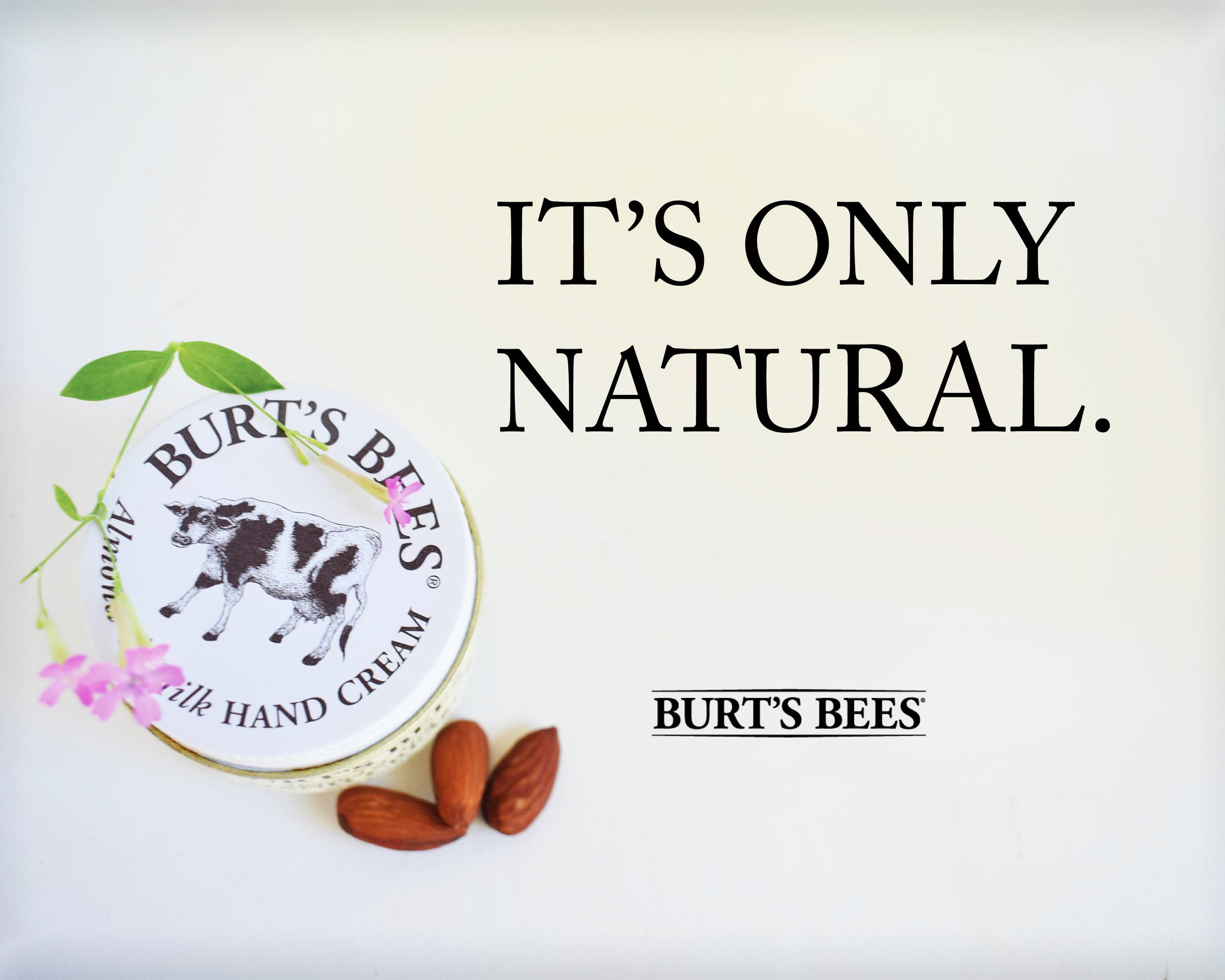
I took this photo for an ad campaign project for Burt’s Bees. The company sells natural products that have expanded into the skin care and makeup industry more and more in recent years. The photo shows the organic shapes of almonds and wildflowers on a neutral backdrop. Deciding on the slogan “It’s Only Natural,” was just part of the fun.
Burt’s Bees Photo Ad
Original Photography
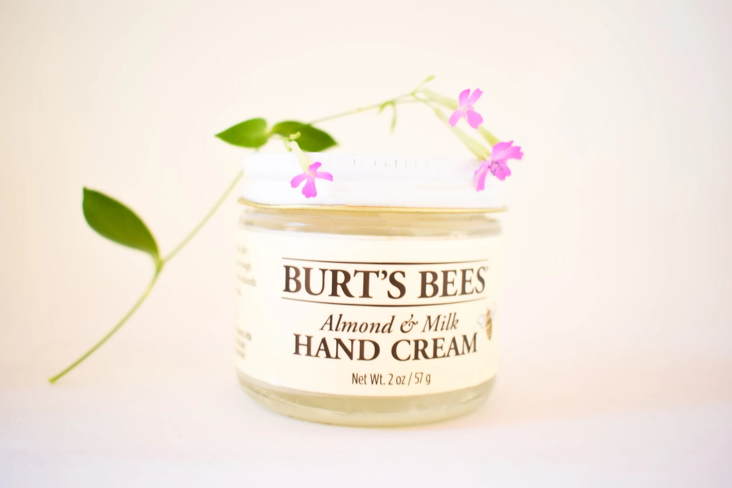
When I took these photos, I worked on leaving room for typography. I built a lightbox to filter in just the right lighting for the project.


Color
The color for this project comes from the natural elements it contains. The flowers, almonds, and warm lighting.

Typography
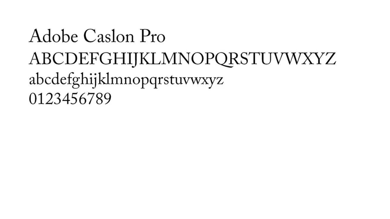
I wanted a classic Burt’s Bees look and Adobe Caslon Pro was my answer. Straightforward yet wholesome, this font clearly conveys that Burt’s Bees products are only natural.
Digital Iterations
It’s only natural to want the right lighting. Putting together this DIY lightbox was an important step toward getting good photos.


Final Designs
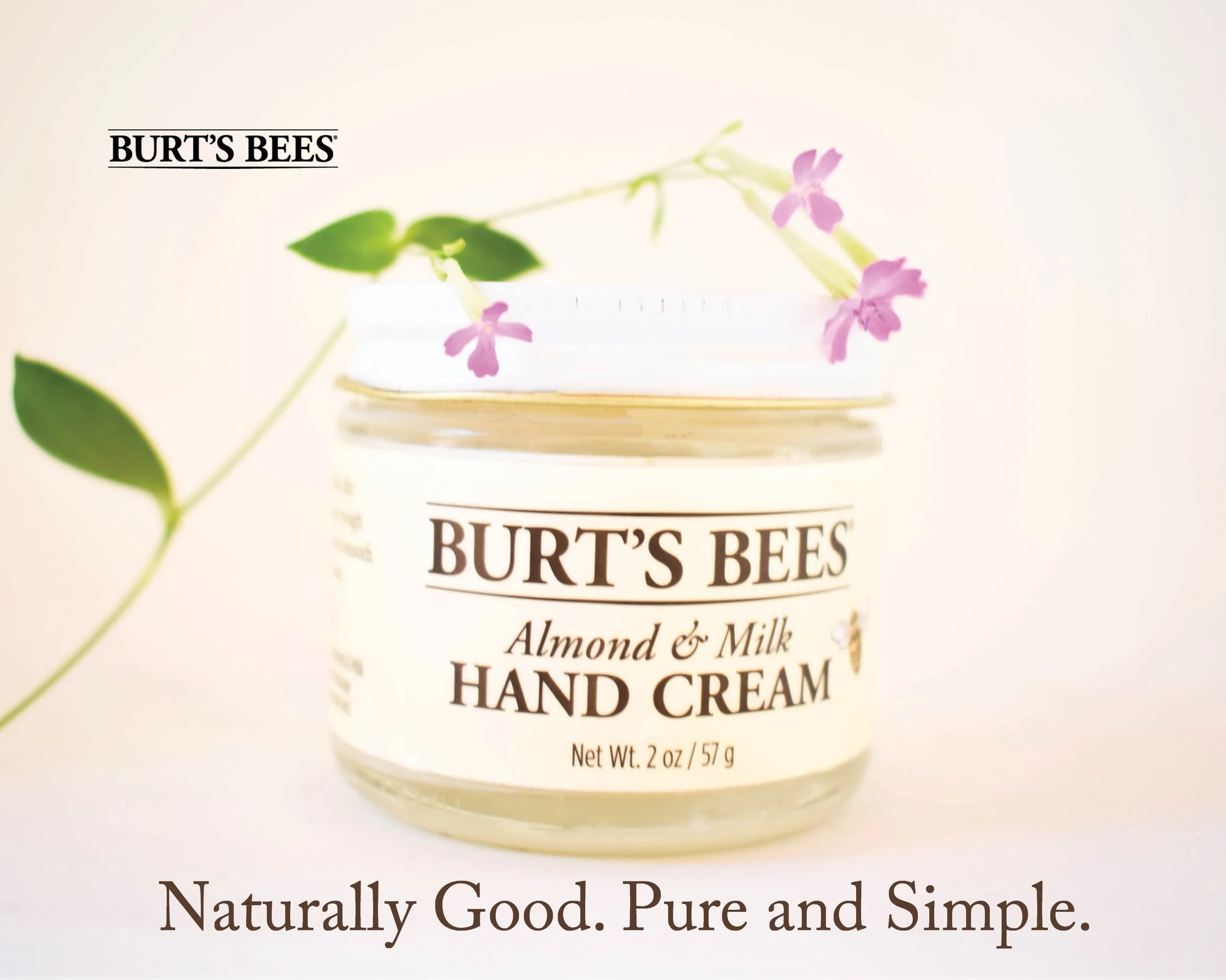
Here the photo has been lightened and “Burt’s Bees” has been brought down further toward the corner to create more balance and an interesting use of negative space. This can be used as a sign, billboard, or on a bag. The fresh, natural color and simple typography further the idea of this product being “only natural.”