

Book Cover Redesign
Tolstoy was able to look into the heart and mind of all his characters and his writing showed all the little interpretations and perceptions we make while observing others. The message of Tolstoy's writing is timeless. The comparison of the lives of Anna and Levin is a stark contrast.
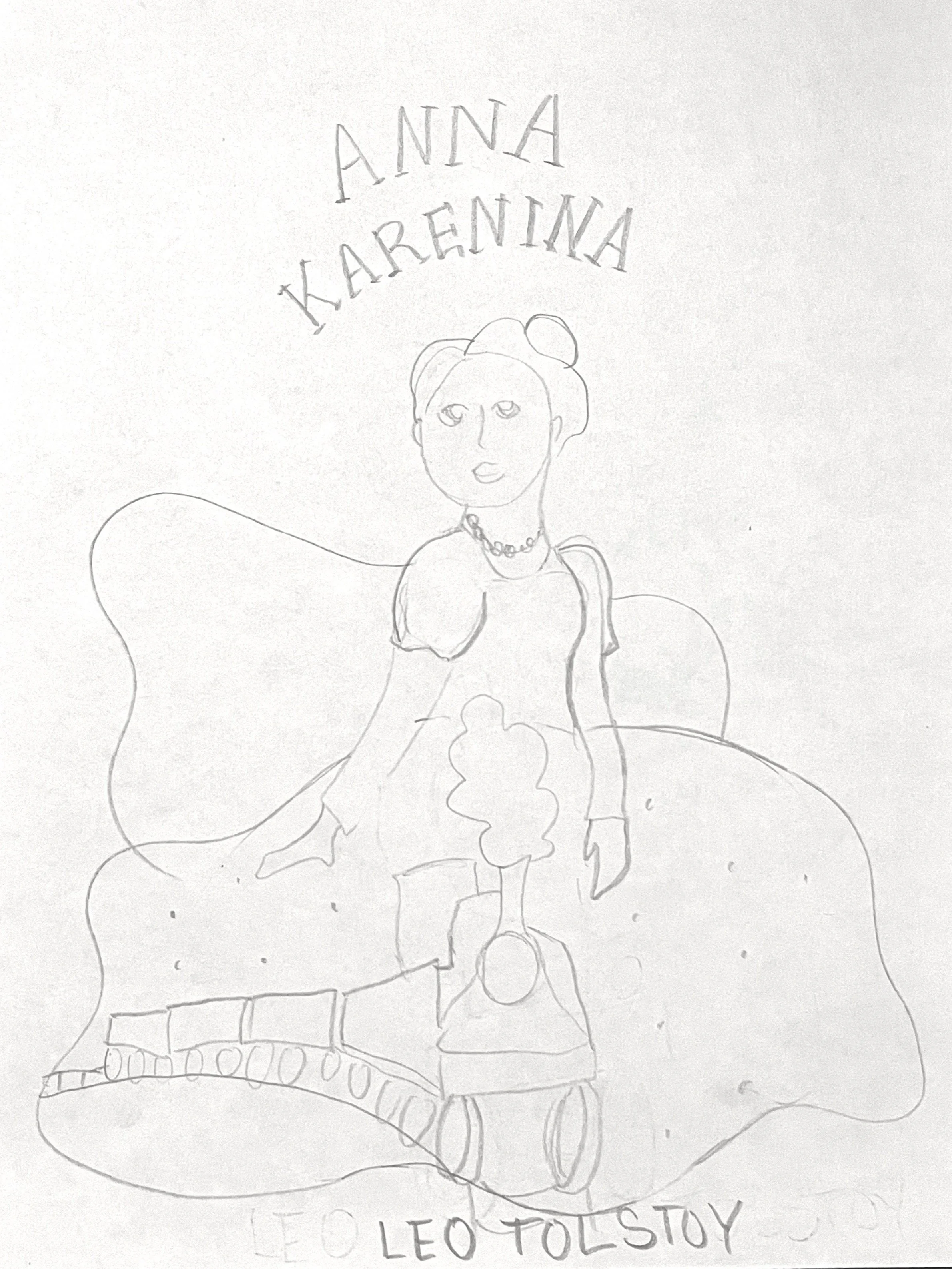
Original Sketches
Anna is seated in a beautiful dress. The train is an image that symbolizes how her vanity and unfaithfulness are making a wreck of her life. If you've read the novel you know the significance of the train. Here the train is contained within her elegant clothing. Which hurt her more the internal or the external wreckage of her life? All the other sketches I created show the differences between the lives of Anna and Levin. I can see any of them working, but the train gave such an accurate picture of Anna that I wanted to try it.


Color
The color of the title typography is taken directly from Anna’s dress. This helps pull the composition together and makes it more of a seamless whole.

Typography
I chose Adobe Garamond Pro for this project because, though the book cover was redesigned, I wanted to keep a bit of formality and reference to the time period the story takes place in by using a serif font. Adobe Garamond Pro has an elegant look that lends itself the the fancy dress and ornate bench.

Digital Versions
Anna went through several digital versions at the beginning. In the one on the left, the smoke of the train and fog became distracting and in the one on the right, the feet of the bench were not fully on the ground.


Final Version
In this version, Anna is facing in the opposite direction of the originals. This helped to fit the train correctly. The composition was made from six different photos and the liquify filter helped change the expression on the woman’s face.


